Case study
Introducing a Bidding feature to increase sales for a B2C whisky and wine investment marketplace

I led the UX and product design for a project focused on integrating a bidding feature into a newly launched B2C Whisky and Wine investment marketplace. We focused on two distinct applications of the marketplace: a mobile Customer app and a web-based Inventory platform.
The aim was to boost user engagement and sales by enabling users to bid on individual stock items. This initiative was part of a broader strategy to transition from a sales-driven approach to a self-serve model, and to move towards a vibrant Marketplace with user-generated sales and bids.
This feature is currently being developed and ready for launch in Q4 2024.
Key results (projected)
40% increase in sales through the bidding feature
Increase in user engagement and satisfaction
More strategic stock decisions through detailed bidding and user profiles
Methods
Competitive research
User stories + task analysis
Journey mapping + user flows
Wireframing (lo-fi and hi-fi) + prototyping
UI design
Componentisation and Design System integration
Collaboration & Timeline
I collaborated closely with a Product Manager, two front-end engineers and two back-end engineers. The main stakeholders were the CEO and the Head of Product.
The project spanned ~6 weeks in 2024, requiring careful coordination between the front-end Customer app and back-end Inventory platform to manage bids and stock effectively.
This case study has been anonymised for confidentiality purposes. The name of the company and product has been omitted while maintaining the integrity of the project outcomes.
The discovery
We began the project by identifying core user needs.
For customers, it was essential to bid easily and track their bids in real time – and the future-proof strategy was for customers to list their own products and make them available for bids
Inventory users needed a clear overview of all bids to approve or reject them efficiently – the system also had to be designed to accommodate automated bid management in the future
To start us off, I organised a kickoff meeting with the PM and our stakeholders to capture goals and requirements, ensuring alignment on expectations and scope.
Due to the marketplace being newly launched, we were unable to conduct direct research with customers or leverage user data. Instead, I conducted competitive research to gain insights into industry standards and best practices.

The process
I then organised a workshop with Engineers to discuss technical constraints and the bid management orchestration between the front-end and back-end systems. This collaboration was crucial for understanding how the two systems would interact and what we would need to consider for an effective user experience.
The PM and I developed user stories for both audiences, making sure they aligned with our business objectives of enhancing engagement and driving sales through the bidding feature.
These user stories were key for me to develop user flows and journey mapping to lay out the entire experience for both the Customer App and the Inventory App.
The design
Once the whole team was aligned on the flows and interactions, I created wireframes for both the Customer App and the Inventory platform, iterating based on stakeholder and engineer feedback. These wireframes served as the foundation for prototyping various bidding flows, allowing us to identify usability issues early and iterate further.
We made critical UX decisions, such as implementing a clear and intuitive bid tracking system for customers and an at-a-glance Auction view for inventory users to manage incoming bids effectively. This streamlined the bid management process and laid the groundwork for future automation, including user-generated auctions – although there were trade-offs for the MVP experience, including not having human readable IDs for Auctions.
Once we were aligned on the interactions and UX of the feature, I moved on to the UI design.
The process
I presented and iterated on the UI designs, based on feedback, and put together a prototype to validate the Customer App flow with stakeholders and the team.
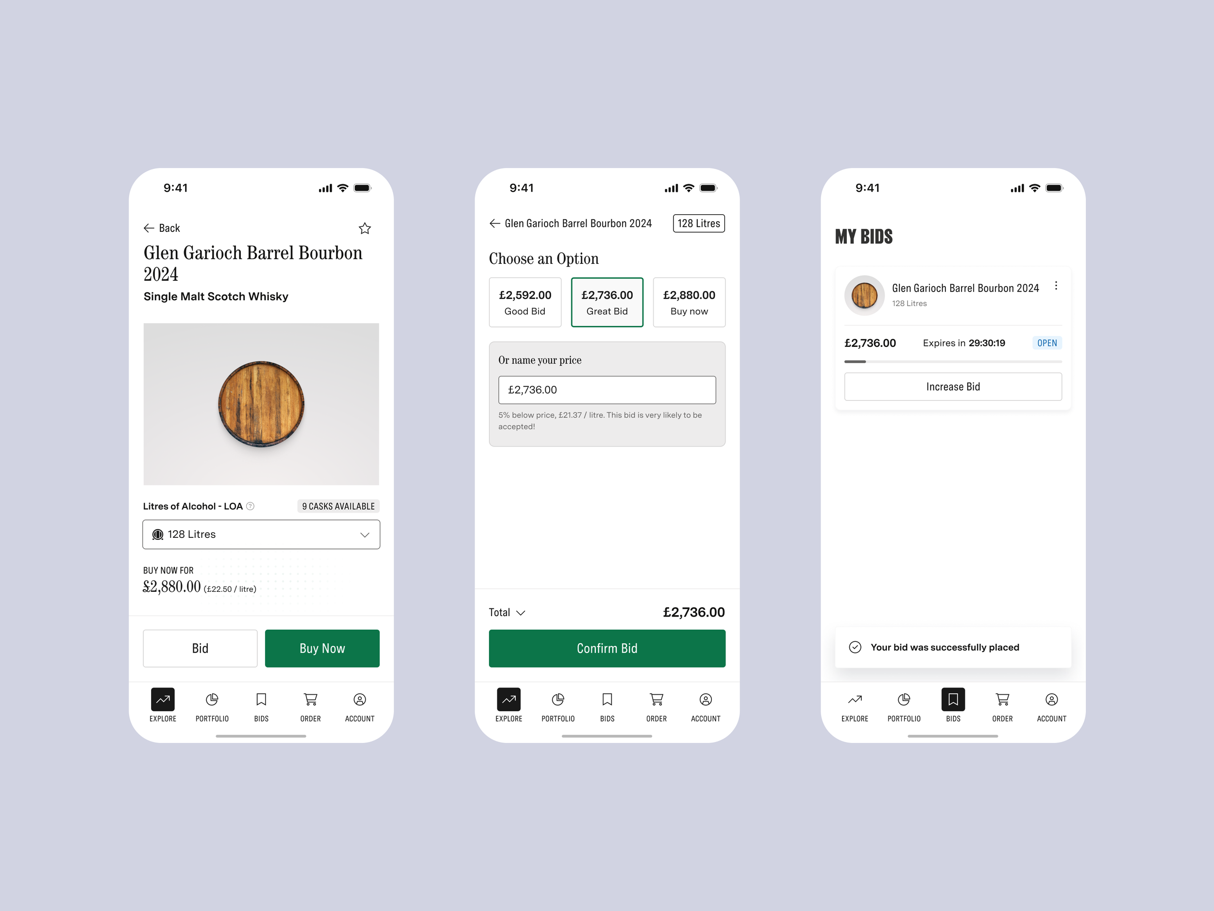
The final UI design featured a user-friendly and engaging bidding interface:
Customers could easily place and track bids
Inventory managers had a streamlined view of all active bids per stock item, allowing them to approve or reject them directly on the platform.
A significant challenge that we identified on the fly was the need to ungroup stock items from product listings, allowing individual stock item bidding. We went back to the drawing board and tightened the orchestration to make sure we enabled this approach, so that we could have separate bidding for each stock item, improving stock management and future flexibility within the marketplace.
The results
40% projected increase in sales: the introduction of the bidding feature projected a significant sales boost by making stock items more appealing for users and giving them more control over what they are willing to pay
Projected increase in user engagement and stickiness thanks to the bidding area, with users checking their bids on the Customer App
Clearer visibility into user engagement and bidding behaviour, leading to more informed decisions about stock management and strategic stock decisions, such as identifying which stock items to highlight based on user interest and bidding activity or which popular stock to re-order

Takeaways
A key takeaway from this project was the importance of balancing business goals with user needs. By aligning the bidding feature with customer expectations and internal workflows, we developed a solution that was effective and scalable for future iterations.
Early workshops with Engineers streamlined the development process, ensuring seamless integration of the front-end and back-end systems. This orchestration was vital for delivering the project on time and within scope.
Finally, introducing lo-fi and hi-fi wireframes early and iterating on the flows allowed us to gather valuable insights that significantly enhanced the user experience.
Check out the UI designs and the flows 👇
EXPLORE MORE CASE STUDIES
